Statements | The problem with watchOS
These issues are what I encountered in real life.
Your mileage may vary.
Beginning of this journey
Apple announced watchOS 10 at the 2023 WWDC on June 5, 2023. Which includes “Comprehensive app redesigns for more information at a glance. Advanced metrics, views, and experiences for cyclists. And insights for mental and vision health. It’s the biggest update since the introduction of Apple Watch.”
Quotes Apple: Everything you love. Like never before.
If you ever heard about the old saying: If something is too good to be true, it probably is. While the “exciting” new features do get landed, there are major regressions brought by this so-called feature-packed update, to the point where I’d like to call it a hot piece of garbage.
Rough bumps
Deconstructing the iconic bubble UI
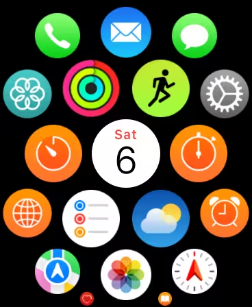
Be familiar to the old bubble UI? Check it out using watchOS 10, and see if you can find anything different.
You guessed it, it’s the clock icon.
Along with this OS upgrade, Apple apparently rethinks the whole navigation logic. Now you’ll find no clock icon in the App list, and an over-scroll will take you to the all new widgets UI, which will be discussed later.
Widgets all the way down
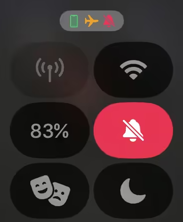
Right after the OS upgrades itself to version 10, one key element you’ll probably notice is swiping up doesn’t bring up control center anymore. It’s now occupied with what Apple calls Widgets, which can be activated at the clock face by either turning the digital crown up or scrolling up on the touchscreen. Now you’ll have to use the side button to bring up control center.
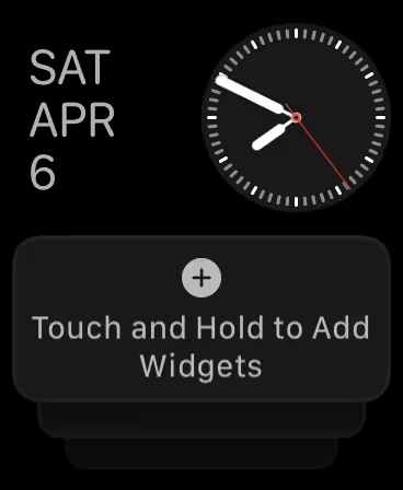
Okay, this is already annoying… But another issue is this Widgets interface can not be disabled by any means, even if you removed all widgets, it’ll look like this:
So, yeah. Great feature forcing users to change the way interacting with the device, classic Apple OS upgrade.
Serious Issues
Randomly Dying Battery
Note: This topic is somewhat controversial, not all users will encounter this issue.
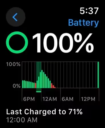
This situation where battery is drained happened multiple times, which seems to only happen when Cellular Data is enabled. This issue will not resolve by itself unless the user manually reboot the device.
Good work persuading me to trade in my 1.5-year old watch for an Apple Watch Ultra.
Ugly Blur across the entire OS (buggy btw)
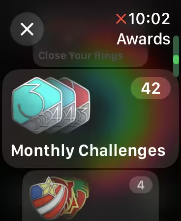
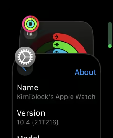
Aside from the Control Center, the second biggest change introduced by Apple is the weird glass effect throughout the entire OS.
Let me take 2 examples from the Fitness app & Maps:
There’re 2 layers of blur, one on top of the base interface and another one under the header bar.
Despite the fact that this is a full screen dialog, there’s a blur layer underneath it.
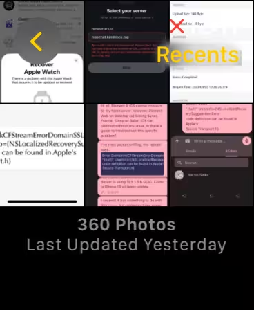
The above examples are designs what I’d like to call ugly. Let’s bring up Photos to show how buggy it is.
Looks normal, isn’t it? But what will happen if you enter a detailed view then use the digital crown to go back to previous view?
Meh, maybe the blur layer bugged out for a reason.
Multi-tasking
Multi-tasking can only be triggered with a double click on the digital crown. Aside this, there’s an annoying new feature which will automatically enter the App displayed on screen when multi-tasking UI isn’t interacted within a few seconds.
More issues
This list contains bugs I encountered. Your mileage may vary.
- Photos not syncing until a reboot occurs
- Inconsistency across the OS
- Sleep tracking not working randomly
Notice
I’m using the latest version of watchOS as of Apr 9 2024.

